Creating the visual identity for Autisme amb Futur was much more than designing a logo — it was about giving shape to a cause and a shared mission. Through research, conversations, and active listening, we came to understand that autism is not a single reality, but a broad, diverse spectrum. And, in many ways, we all share traits that connect us to it.
Task
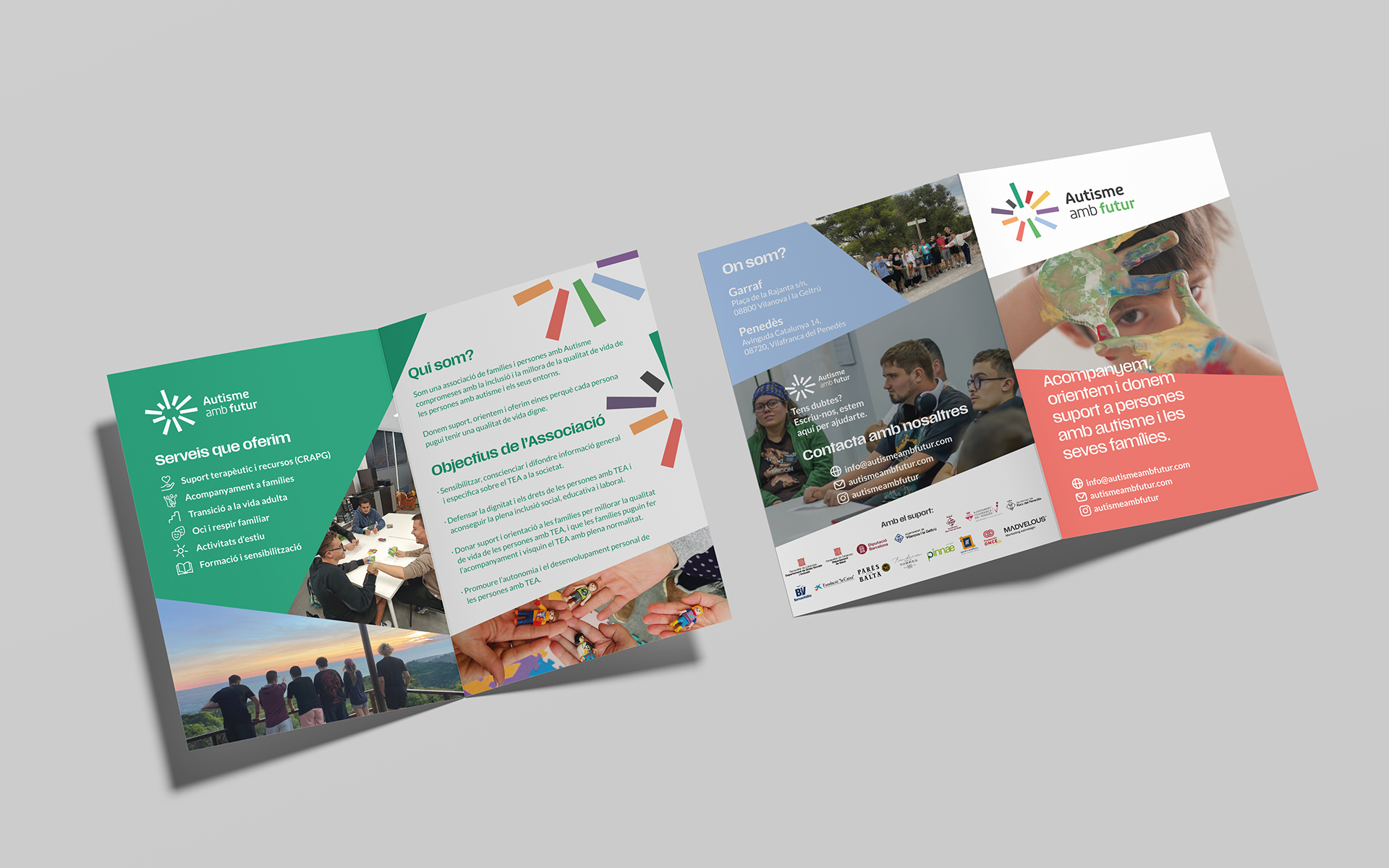
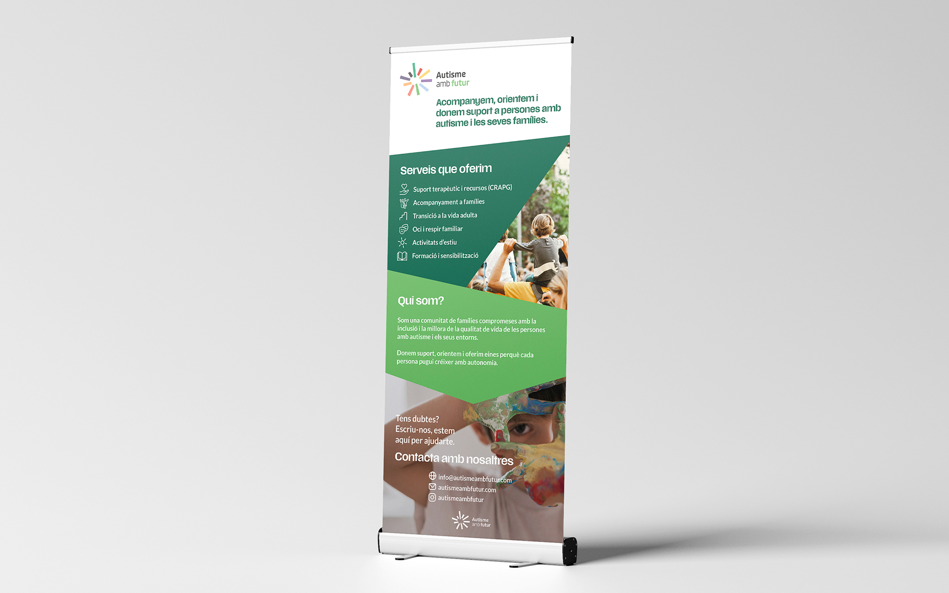
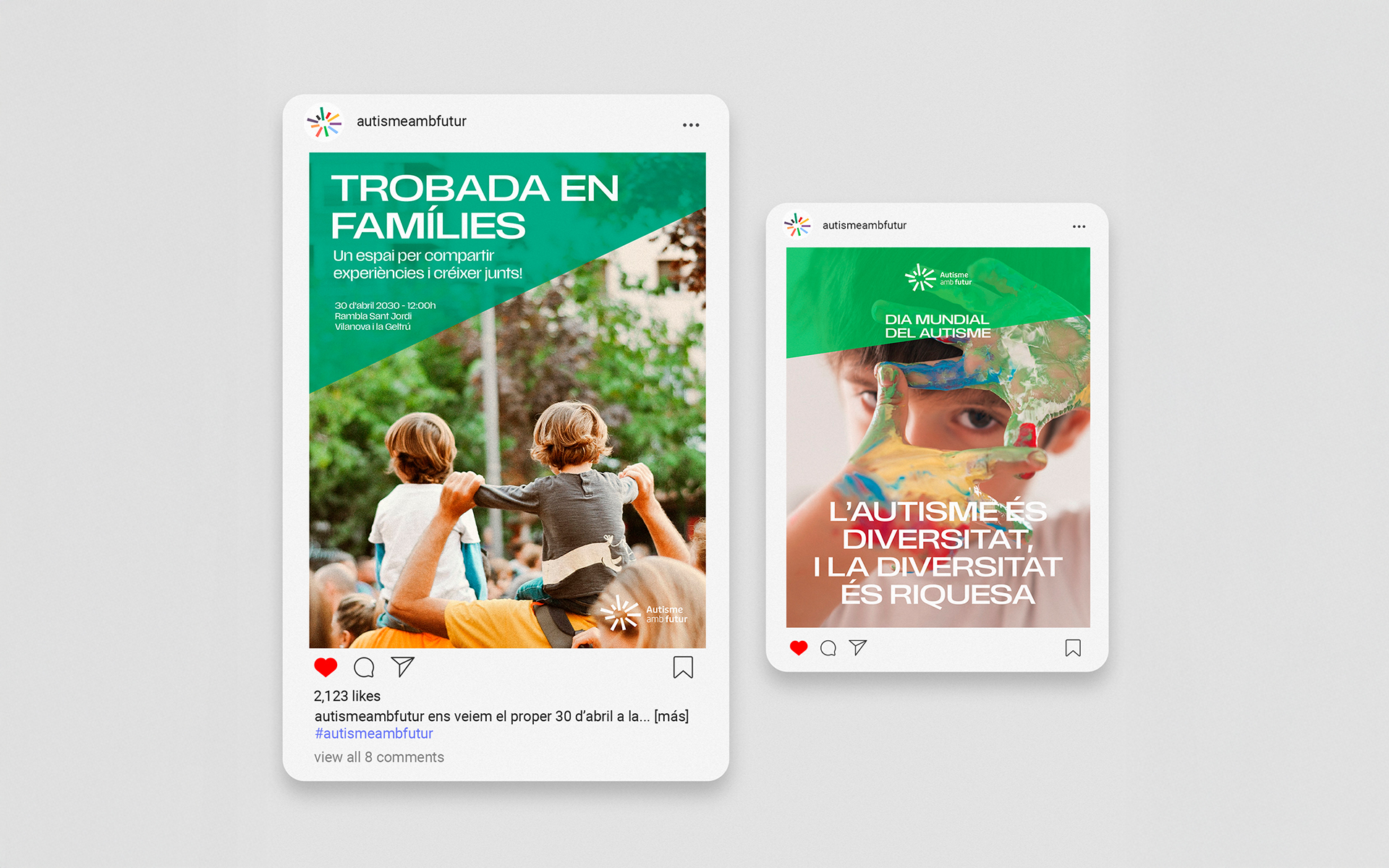
Brand research and conceptual development, logo design, creation of the visual identity system, definition of colors and graphic elements, development of brand guidelines, and design of initial applications for communication and digital use.
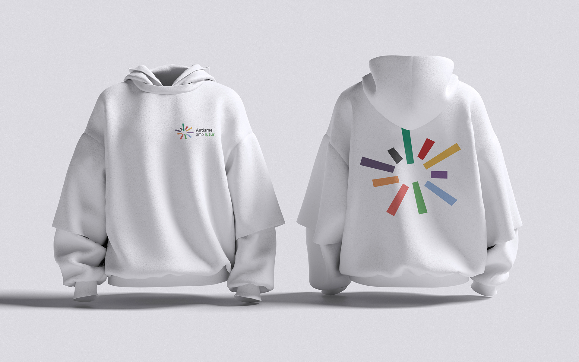
That insight led us to create a symbol built from diversity: a set of bars in different colors and sizes that represent the autism spectrum. Each element is unique, with its own presence and weight, yet together they form a unified core — a circular shape that symbolizes community, inclusion, and equality. Different parts, one shared space.
The identity conveys empathy, optimism, and belonging. It doesn’t aim to label or standardize, but to embrace difference and highlight the idea that everyone is part of the same whole. The name Autisme amb Futur looks ahead, and the visual language reinforces that vision: a future built together, where everyone matters.