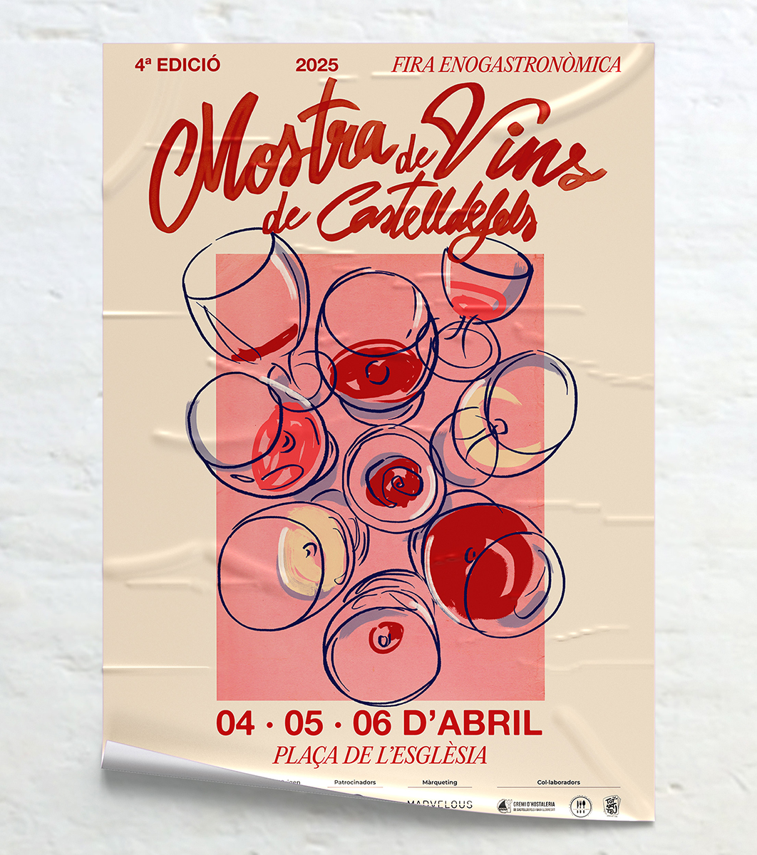
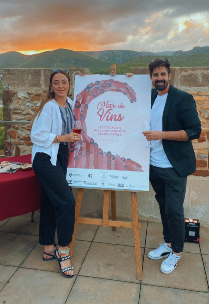
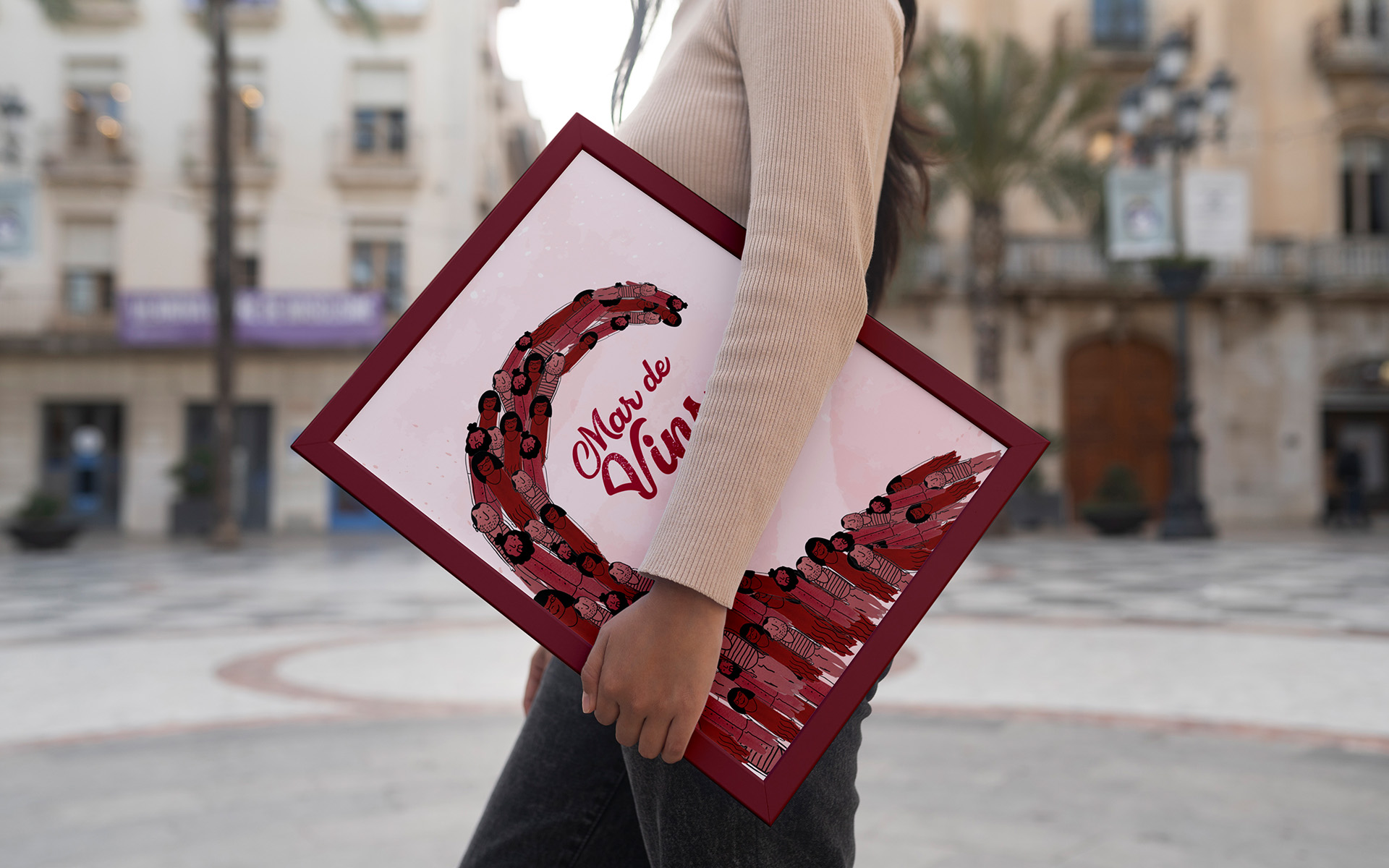
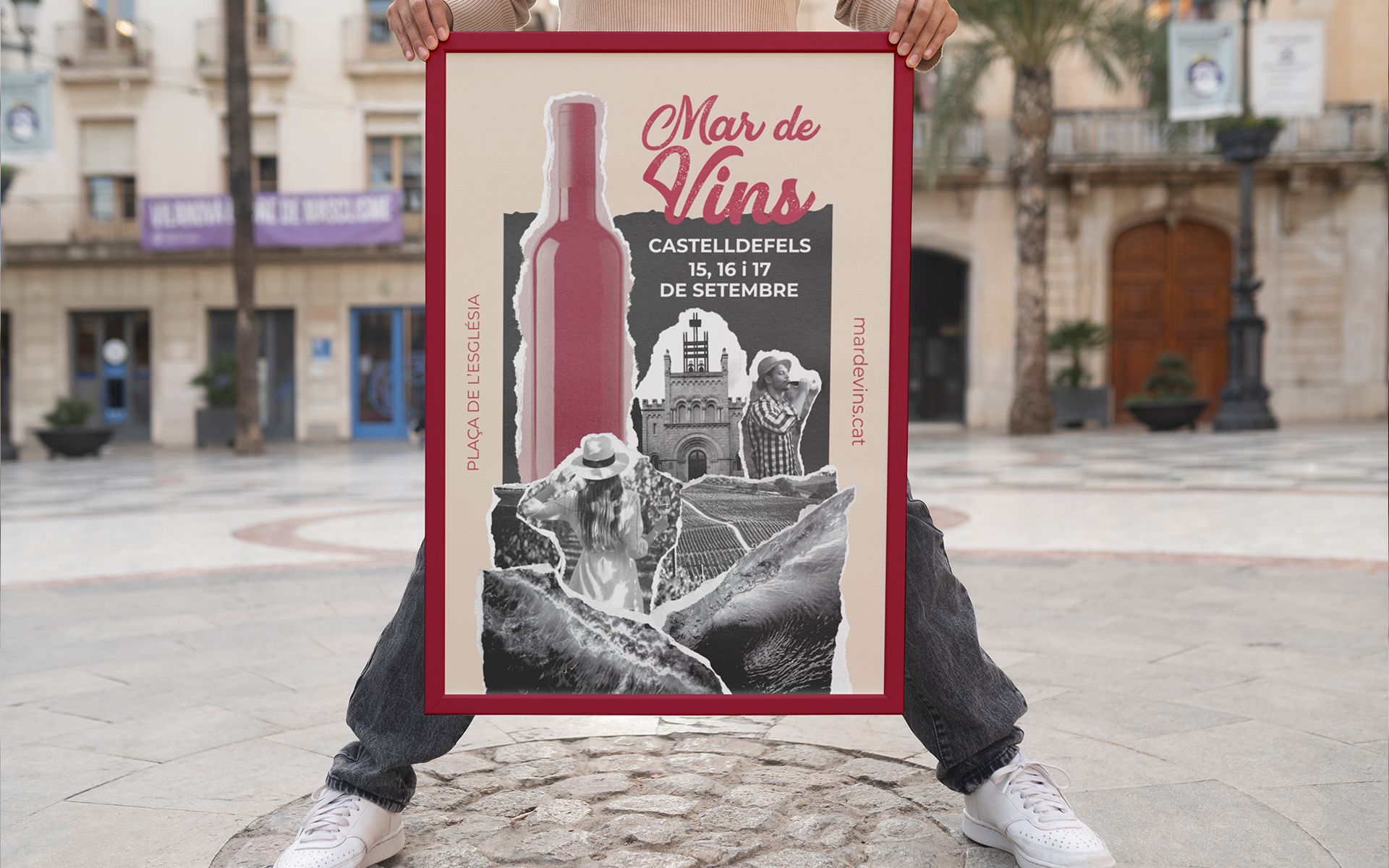
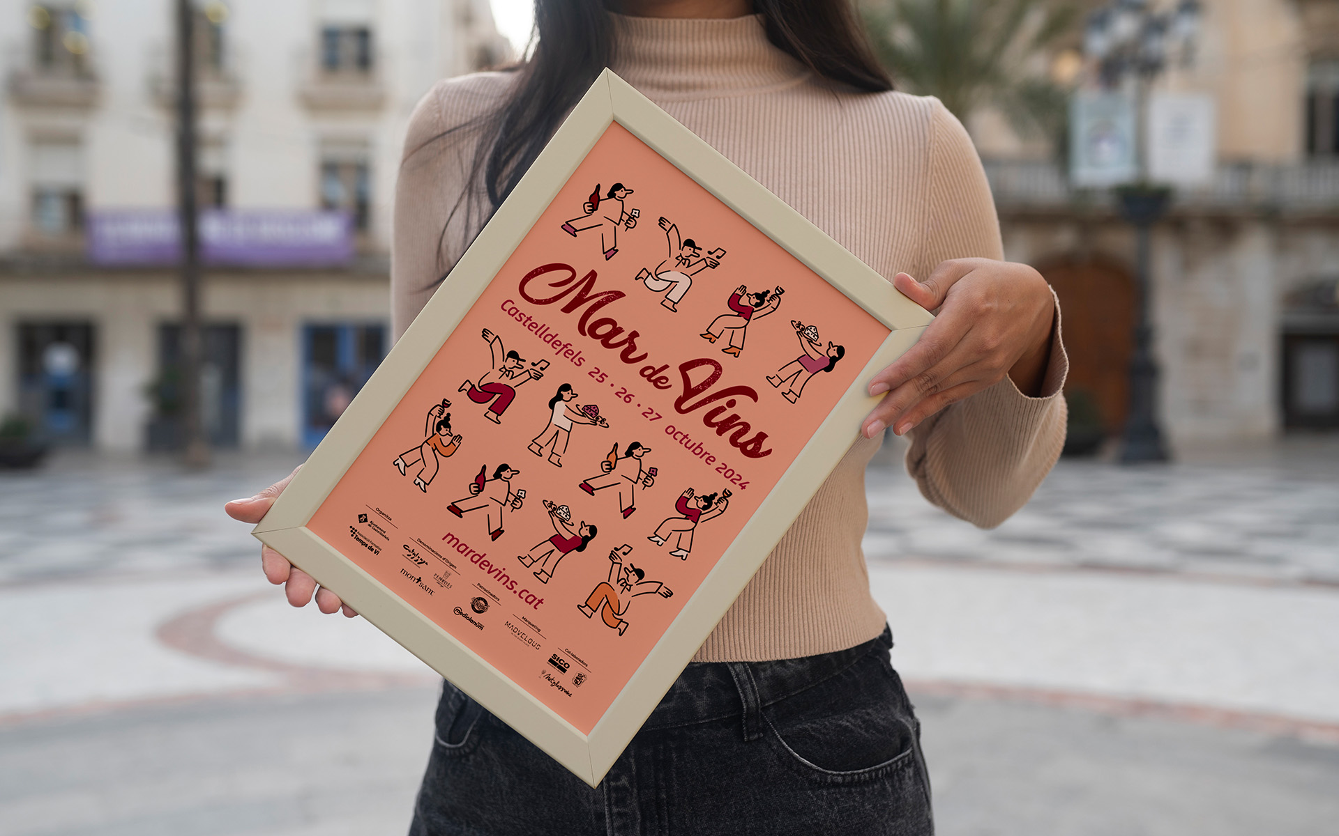
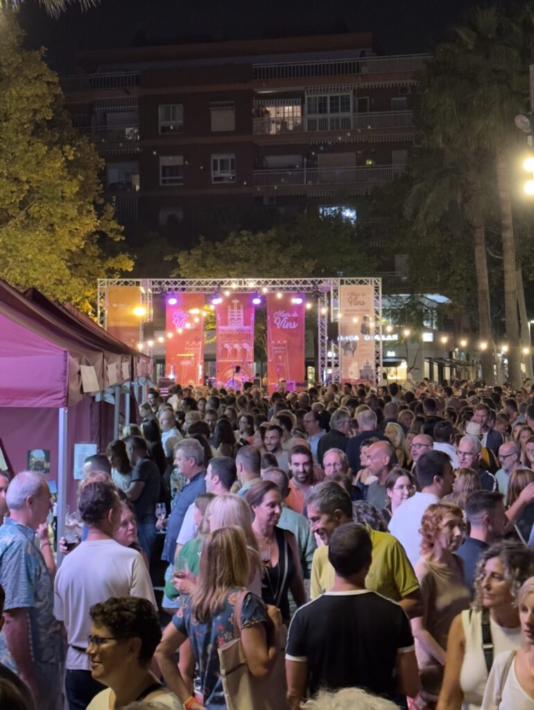
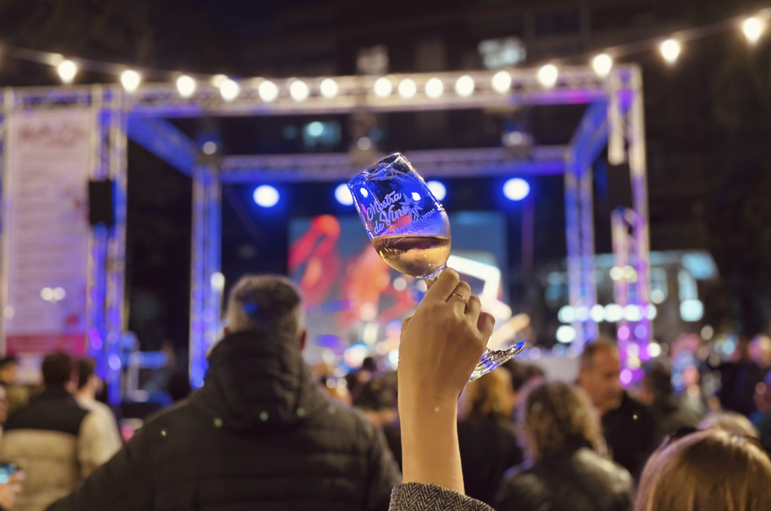
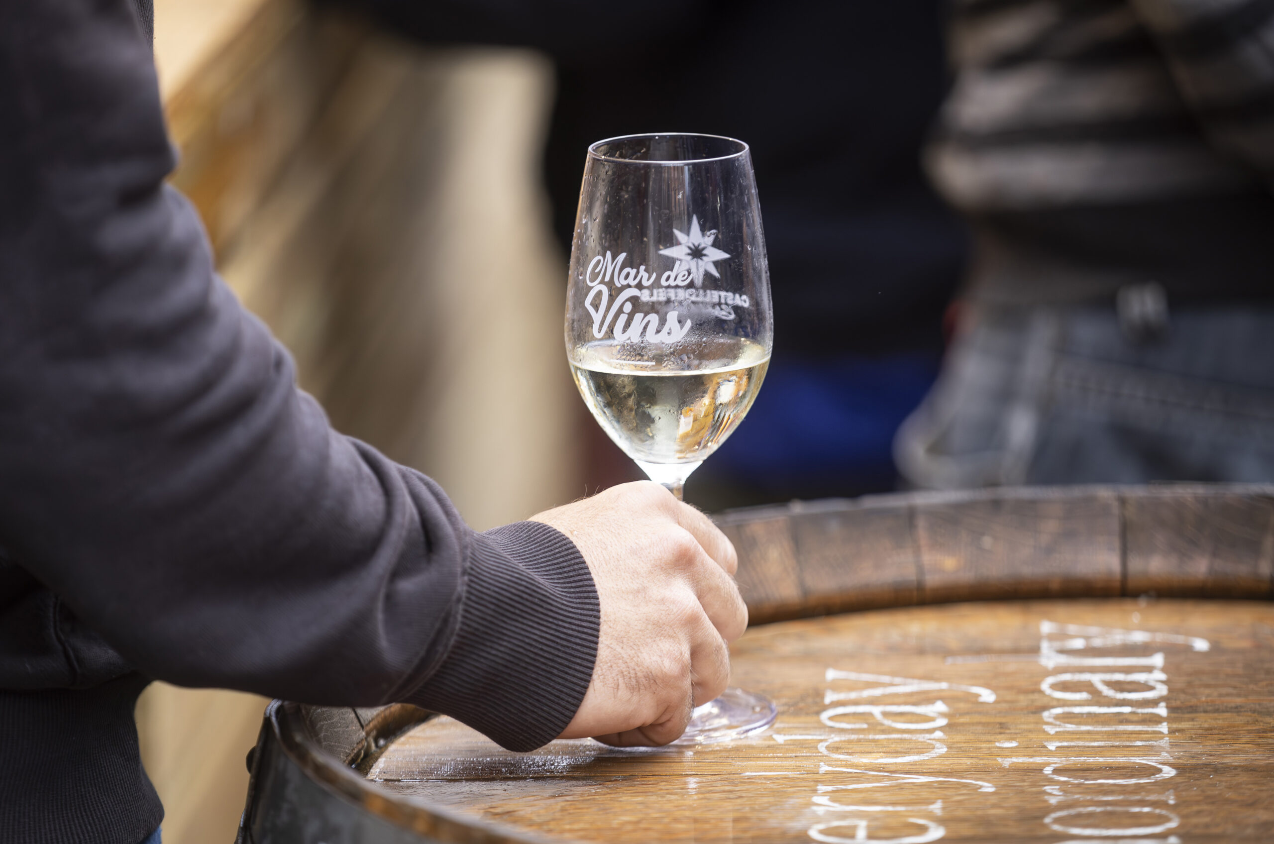
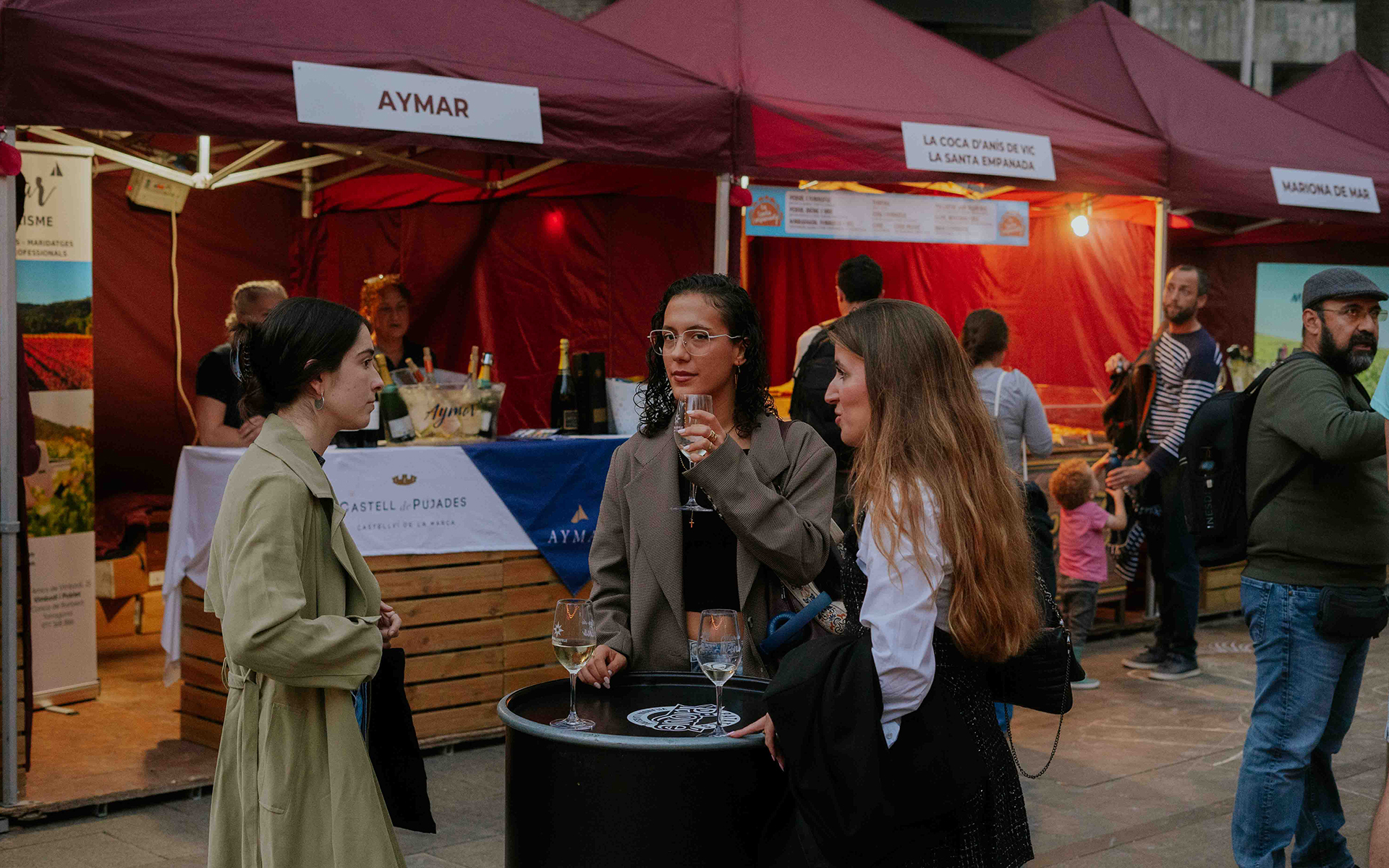
Mostra de Vins de Castelldefels is a wine-focused festival that combines gastronomy and live music. The event launched in 2022, and I’ve been responsible for the brand from day one—creating the initial identity, establishing the core visual system, and evolving it each year to keep the festival fresh, coherent, and recognizable across channels.
Task
Build a scalable identity from scratch and adapt it in 2025 to a new legal name—preserving recognition while updating the brand architecture.
From the start, the challenge wasn’t just to design “a poster” — it was to build a festival identity that could grow with the event. Across editions, the brand needed to:
Stay consistent and recognizable year after year
Evolve visually so each edition feels new (without starting from zero)
Work across many formats, from large-scale print to digital and on-site materials
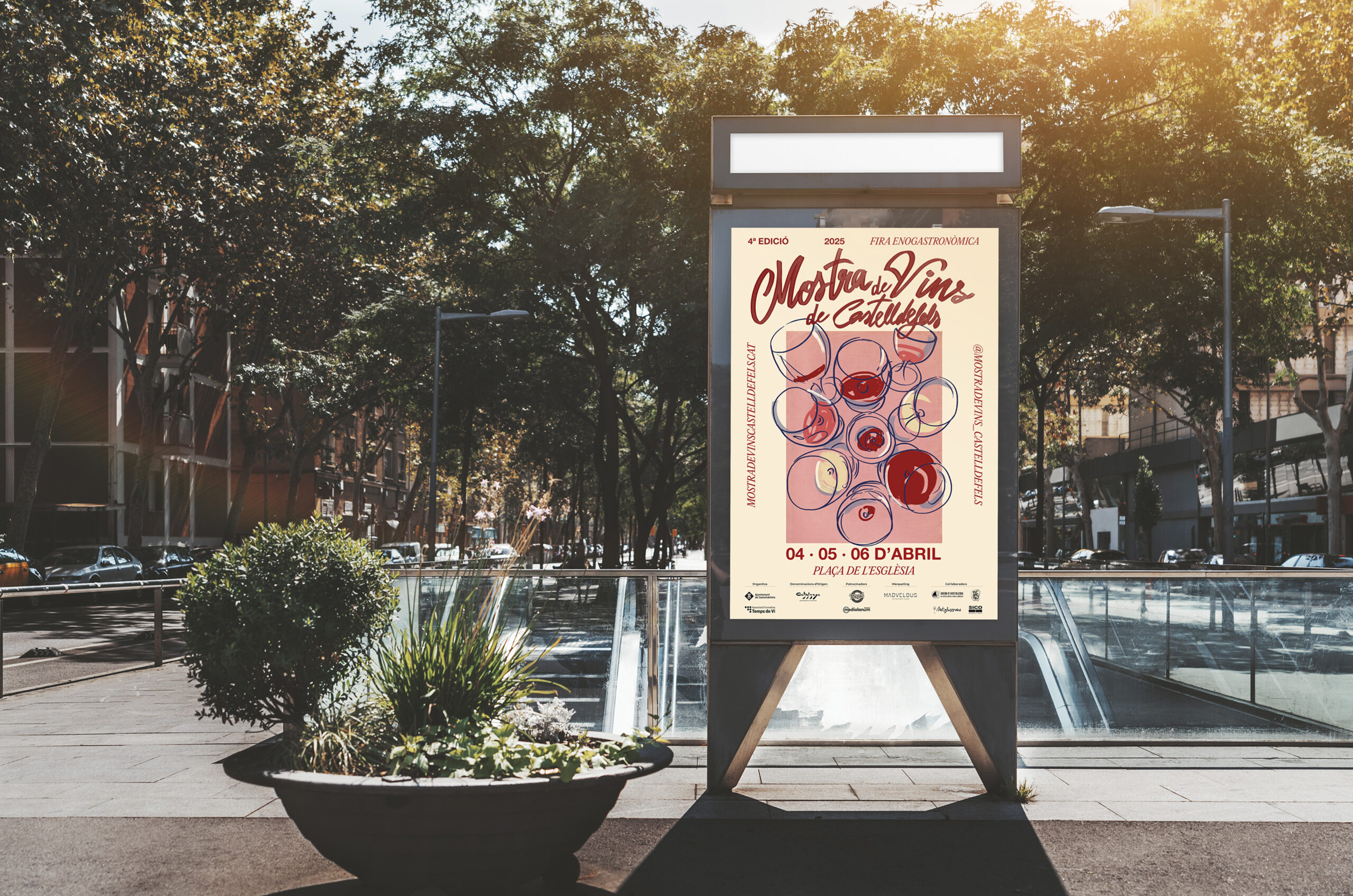
In 2025, an additional constraint appeared: the festival needed to change its name for legal reasons, transitioning from “Mar de Vins” to “Mostra de Vins de Castelldefels”. The rebrand had to be handled carefully—updating the identity without losing continuity.
Objective
Create a flexible brand system for a recurring festival: strong enough to build recognition over time, but modular enough to support yearly campaigns, new assets and new editions. In 2025, adapt the system to a new legal name while maintaining familiarity and brand equity.
Approach
I treated the festival as a living brand system—built on stable foundations and designed to evolve through editions.
The approach combined:
Brand foundations: typography, layout logic, hierarchy, and core brand cues that stay consistent
Edition-based creativity: a new key visual direction each year (color, composition, graphic elements, campaign mood)
Guidelines and production rules: ensuring the identity stays coherent across formats, partners and printing requirements
For the 2025 rename, I kept the system intact where it mattered—structure, recognition cues, tone—while updating the naming architecture and key assets to reflect the new legal identity.
Execution (touchpoints)
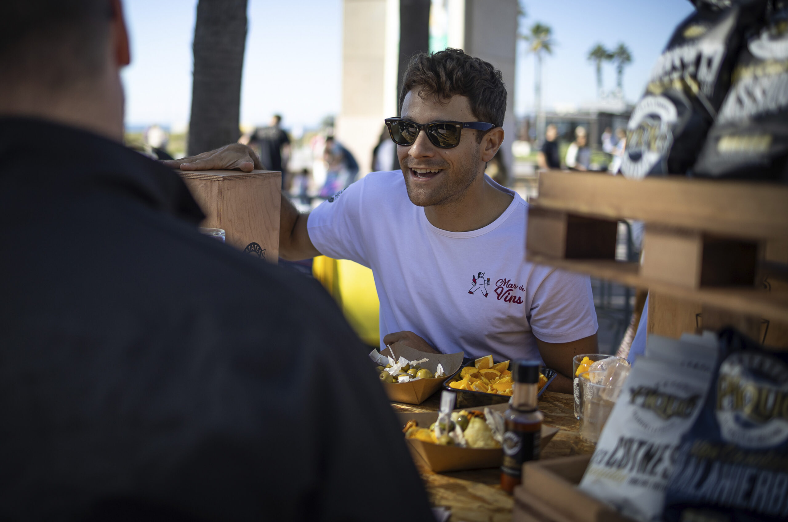
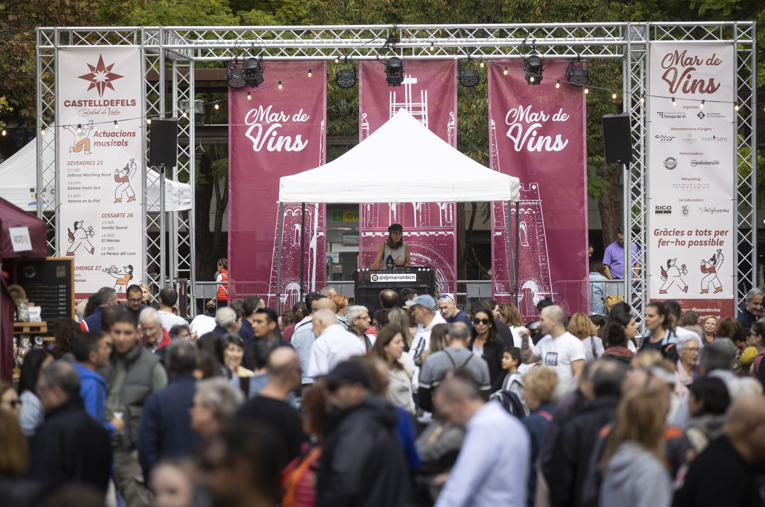
Across editions, the identity system was applied consistently to a wide range of materials, including:
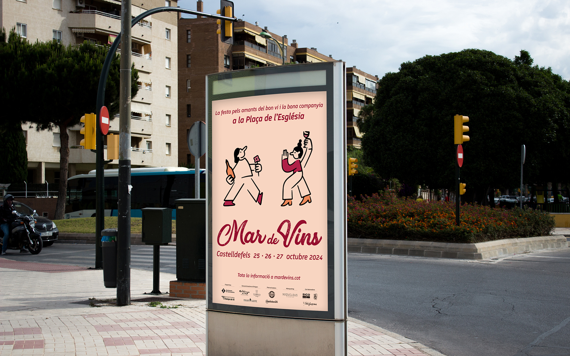
Main posters and campaign visuals (per edition)
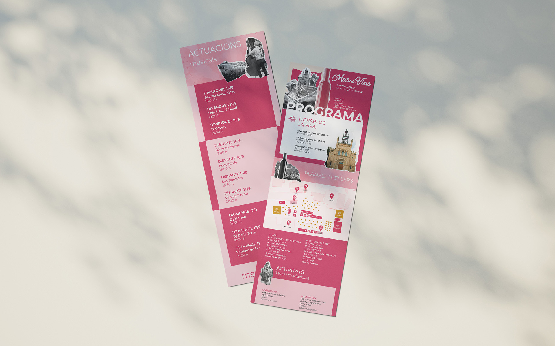
Festival programs and print collateral
On-site signage and large-format pieces
Social media content and digital assets
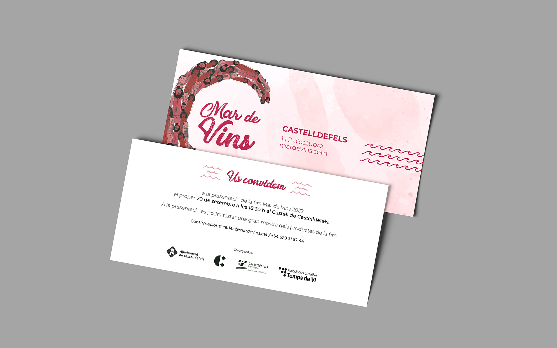
Tickets, invitations and supporting event materials
Production-ready artwork adapted to different formats and suppliers